
Transform Your Space: Embrace 10 Vibrant Colour Palettes Redefining Interiors in 2026
- Mar 10
- 4 min read
The era of bland, sad beige walls and uninspired interiors is coming to an end. In 2026, interiors are set to burst with bold, confident colours that bring personality and warmth to every room. Earthy umber, desaturated sky blue, ochre, pistachio-chartreuse, moody indigos, and rich reds are among the standout shades transforming homes and workplaces alike. These palettes offer a fresh way to express style while maintaining balance and harmony.
This post explores 10 vibrant colour palettes that are taking over interiors this year. You will find practical tips on how to layer these colours without overwhelming your space, along with real examples to inspire your next makeover.

1. Earthy Umber and Warm Neutrals
Earthy umber brings a grounded, natural feel to interiors. This deep brownish shade pairs beautifully with warm neutrals like soft taupe, cream, and muted terracotta. Use umber as a statement wall or in furniture pieces such as leather chairs or wooden tables. Layer with textured fabrics like linen or wool to add depth.
Example: A dining room with umber-painted walls, cream curtains, and a terracotta rug creates a cozy, inviting atmosphere perfect for family meals.
2. Desaturated Sky Blue with Soft Whites
Desaturated sky blue offers a calming, airy vibe without feeling cold. Pair it with soft whites and pale greys to keep the palette light and fresh. This combination works well in bedrooms and bathrooms where relaxation is key.
Tip: Add natural wood accents and plants to bring warmth and life to the space.
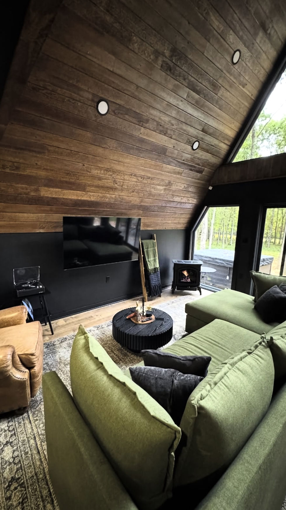
3. Ochre and Deep Greens
Ochre is a rich, golden yellow that adds warmth and energy. When combined with deep greens like forest or olive, it creates a sophisticated, earthy palette. Use ochre on walls or in textiles, and bring in green through plants, cushions, or artwork.
Example: A living room with ochre curtains, a green velvet sofa, and natural wood flooring feels both vibrant and grounded.
4. Pistachio-Chartreuse and Soft Pinks
For a playful yet elegant look, combine pistachio-chartreuse with soft pinks. The bright green-yellow shade adds freshness, while pink tones soften the overall effect. This palette works well in kitchens, nurseries, or creative spaces.
Tip: Use pistachio-chartreuse in small doses like kitchen cabinets or accent chairs, balanced by pink accessories or wall art.
5. Moody Indigo and Warm Reds
Moody indigo brings depth and drama, especially when paired with warm reds like brick or rust. This palette suits living rooms or libraries where a cozy, intimate feel is desired. Use indigo on large surfaces like walls or rugs, and add red through cushions, throws, or lamps.
Example: A reading nook with indigo walls, a rust-red armchair, and brass lighting feels inviting and stylish.
6. Terracotta and Soft Blues
Terracotta’s earthy warmth contrasts beautifully with soft blues, creating a balanced and welcoming space. Use terracotta in floor tiles, pottery, or upholstery, and pair with pale blue walls or curtains.
Tip: Incorporate natural textures like jute rugs or wicker baskets to enhance the organic feel.
7. Burnt Sienna and Creamy Whites
Burnt sienna is a deep, reddish-brown that adds richness without overpowering. Pair it with creamy whites for a timeless, elegant look. This palette is perfect for kitchens and dining areas where warmth and sophistication are desired.
Example: Burnt sienna cabinetry with white marble countertops creates a luxurious yet approachable kitchen.
8. Sage Green and Muted Mustard
Sage green offers a soft, calming base that pairs well with muted mustard for a touch of brightness. This combination works well in bedrooms and living rooms, providing a fresh but understated look.
Tip: Use sage green on walls or large furniture pieces, and add mustard through cushions, throws, or artwork.
9. Deep Plum and Soft Greys
Deep plum adds a regal, moody touch when paired with soft greys. This palette suits bedrooms and lounges where a sense of calm and luxury is desired. Use plum in bedding, curtains, or accent walls, and balance with grey upholstery or rugs.
Example: A bedroom with plum bedding, grey walls, and silver accents feels both cozy and sophisticated.
10. Vibrant Coral and Cool Teal
For a bold, energetic space, combine vibrant coral with cool teal. This palette works well in creative spaces or social areas where energy and interaction are encouraged. Use coral on walls or large furniture pieces, and teal in smaller accents like cushions or lamps.
Tip: Keep other elements neutral to avoid overwhelming the space.
How to Layer Bold Colours Without Overwhelming Your Space
Using bold colours can be intimidating, but with the right approach, you can create a balanced and inviting interior.
Start with a neutral base: Use whites, creams, or soft greys on walls or large surfaces to anchor the space.
Choose one or two dominant colours: Pick your main colours from the palette and use them on walls, furniture, or large textiles.
Add accents in complementary shades: Use smaller items like cushions, throws, or artwork to introduce secondary colours.
Mix textures: Combine smooth, rough, shiny, and matte surfaces to add interest without relying solely on colour.
Use natural elements: Wood, plants, and stone can soften bold colours and create harmony.
Balance warm and cool tones: If your palette has warm colours like ochre or burnt sienna, balance them with cool shades like blue or green.
Bold colour palettes are redefining interiors in 2026, offering exciting ways to express personality and style. Whether you prefer earthy tones like umber and ochre or brighter shades like pistachio-chartreuse and coral, these combinations bring life and warmth to any space. By layering colours thoughtfully and balancing textures, you can create interiors that feel vibrant yet comfortable.


Comments